
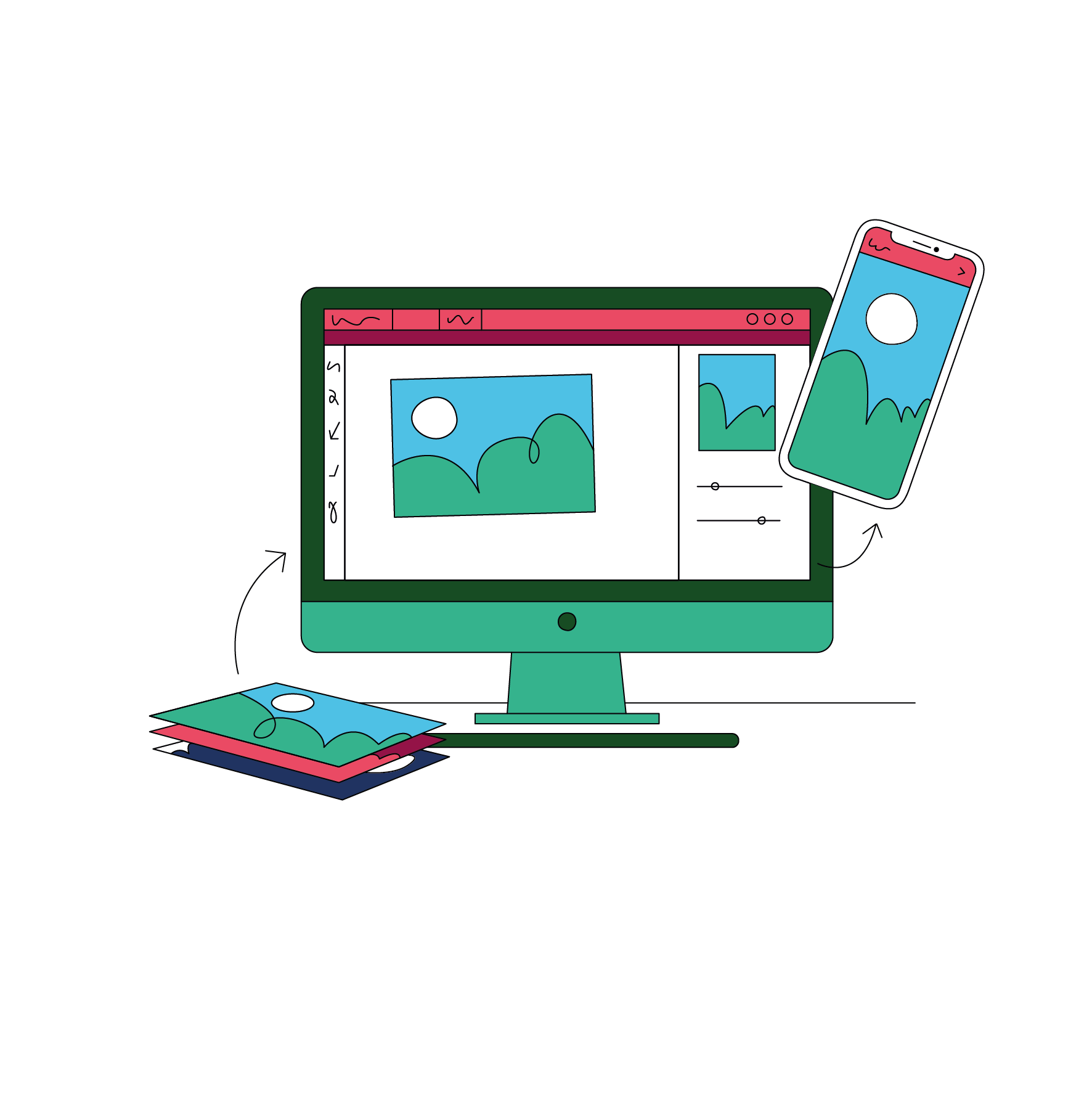
Every old print photo made digital, safe for the next generation.
Back up your old family photos today, access them from any device, and share them with anybody, anywhere. Forever. All without lifting a finger.
"I heartily commend the work of Vintage Photo Lab. They provided a quick, efficient and comprehensive service with the minimum of fuss and bother."
Sir Michael Palin
Sir Michael Palin

Every old print photo made digital, safe for the next generation.
Back up your old family photos today, access them from any device, and share them with anybody, anywhere. Forever. All without lifting a finger.

Decades of memories made safe in a click
Packaging and labels posted to your home for secure pickup.
Courier collection and return from your doorstep.
Express turnaround available.
Access your scans instantly.
Place an order today for complete peace of mind.
Preserve, share and celebrate your old photos
Unlock the treasured memories hiding in your family

We Collect
Home collection from anywhere in the UK
We Scan
Professional scanning and quick turnaround

We Return
Everything returned neat, tidy and in order.
It's all just so easy
Which? Magazine mentioned us in their photo scanning article.
You can read the rest of their very helpful piece by clicking the button below.
 Read more
Your house is on fire, what's the one thing you would save?
Save those old photos today and you'll have time to get the dog too...
Everyone knows there's no insurance available that can bring back your memories. Think of us as your most important policy, and we'll guarantee you won't regret it.
If any part of the family history lies in your hands, that's a big responsibility. Will they survive for generations to come? This is the time for you to cement those stories and to embed them into history. Forever.
Taking care of everything


Your photos digital, where digital photos belong
Instant digital download. 120-year archive quality DVD. USB sticks and digital photo frames as optional extras, pre-loaded with all your scans, making wonderful gifts. Our team can also help transfer your photos to your Apple Photos or Google Photos account so you can access them via the cloud, on any device, at any time, in any place.

Specialists in digitising family albums...
Sibling rivalry, divorce and a global family. These are just some of the reasons why digitising old albums can bring peace of mind to your loved ones.


